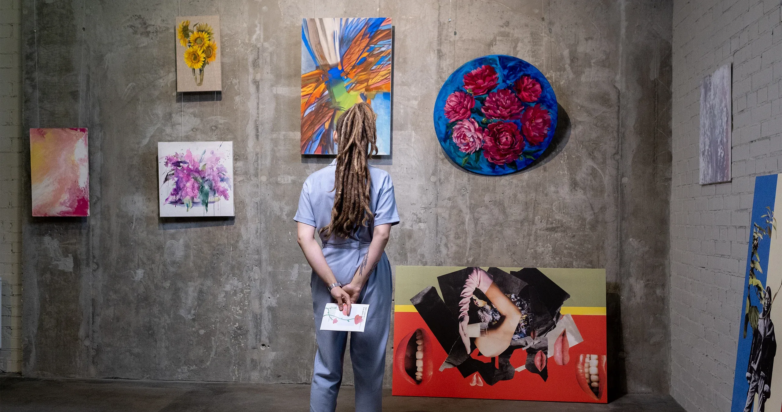
Composition-Heavy Designs
Composition-heavy designs are all about pushing the boundaries of visual arrangement. They break free from traditional grids and linear structures, embracing complexity and visual density. Imagine a canvas where every element dances together, creating a harmonious yet captivating chaos.
Key Elements of Composition-Heavy Designs
- Layering : Elements overlap, creating depth and intrigue. Think of it as stacking transparent sheets, each revealing a different part of the story.
- Asymmetry : Forget perfect symmetry. Asymmetrical compositions add tension and energy. Balance is achieved through strategic placement rather than mirroring.
- Texture and Pattern : Texture-rich backgrounds, intricate patterns, and tactile surfaces enhance the overall composition.
- Typography : Bold typefaces, creative text arrangements, and unconventional alignments play a crucial role.
- Color Harmony : Vibrant colors interact dynamically, drawing the eye to different focal points.
Where to Use Composition-Heavy Designs
- Posters: Bold event posters, movie promotions, or art exhibitions benefit from composition-heavy layouts.
- Editorial Design: Magazines, book covers, and editorial spreads can embrace this trend.
- Web Design: Landing pages, portfolios, and creative agency websites can experiment with layered compositions.
- Packaging: Intriguing packaging designs catch attention on store shelves.
- Branding: Brands that want to stand out can incorporate these designs into their visual identity.
Tips for Creating Composition-Heavy Designs
- Start with a Concept: What story or emotion do you want to convey? Build your composition around that.
- Experiment with Overlapping: Let elements intersect, creating visual tension.
- Play with Scale: Vary the size of elements for added interest.
- Balance Chaos and Order: While it’s complex, ensure there’s still a sense of balance.
- Use Negative Space: Cleverly placed empty areas guide the viewer’s eye.
Examples in the Wild
- Album Covers: Many music artists embrace composition-heavy designs for their album artwork.
- Event Posters: Concerts, festivals, and art shows often feature intricate compositions.
- Fashion Editorials: High-fashion magazines love experimenting with layered visuals.
- Digital Art: Explore platforms like Behance or Dribbble for inspiration.
Composition-heavy designs are an invitation to break rules, explore creativity, and surprise your audience. So grab your digital brush and compose your visual symphony!

