ClientZerro Software development CompanyYear2024CategoryBrandingShare
Project Overview
Unix Studio was entrusted with the branding and visual identity development for Zerro, an emerging Australian software development company specializing in cutting-edge technology solutions. The core challenge was to craft a logo that not only represented Zerro’s technological focus but also resonated with its target audience by reflecting professionalism and technical expertise.
Concept and Inspiration
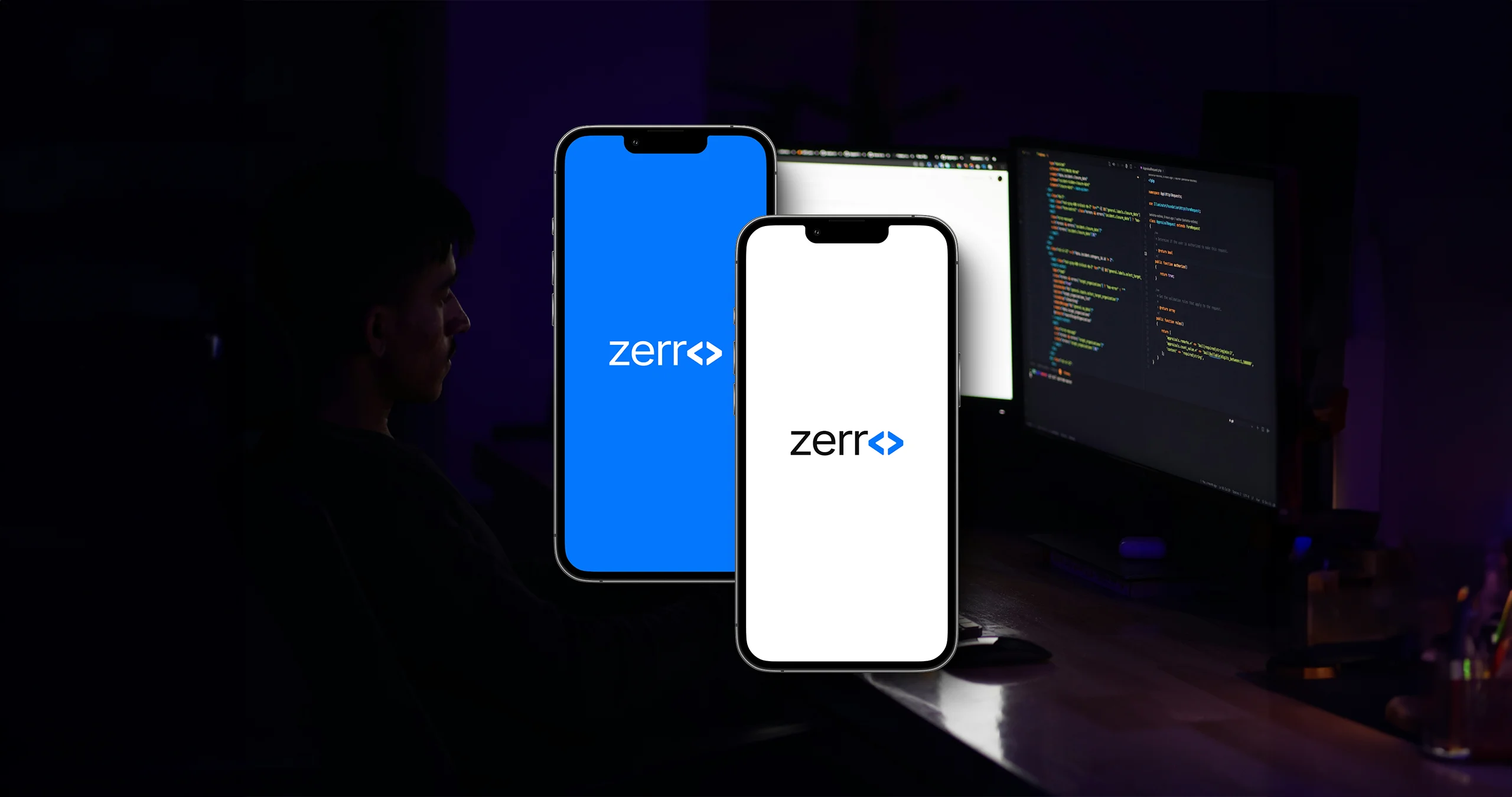
The inspiration behind Zerro’s logo lies in the elegance of simplicity and the subtlety of clever design. At the heart of our concept was the transformation of the “O” in “Zerro” into a pair of coding colons (<>), which subtly references the world of programming—a core element of Zerro’s service offerings. This small yet impactful detail seamlessly integrates coding symbolism without compromising readability or overcomplicating the visual identity.
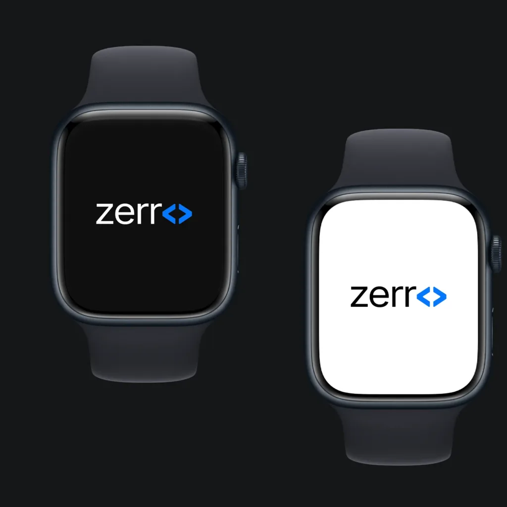
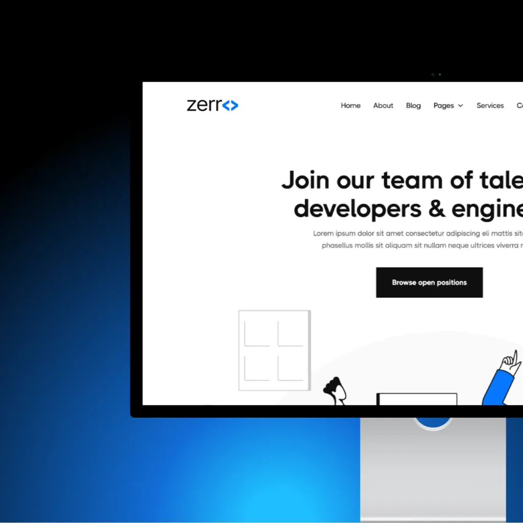
We focused on delivering a clean and modern wordmark that conveys professionalism and technical skill. The unique interpretation of the “O” sets the logo apart, while the overall design remains minimalist and versatile for various applications, ensuring that Zerro’s brand is memorable across different platforms and contexts.
Design Approach
The design process involved exploring multiple concepts that balanced sophistication with subtlety. Our goal was to highlight Zerro’s technical identity while maintaining a sleek, professional appearance. By integrating the coding reference, we effectively aligned the visual identity with the brand’s core values of innovation, expertise, and simplicity.
Color Palette
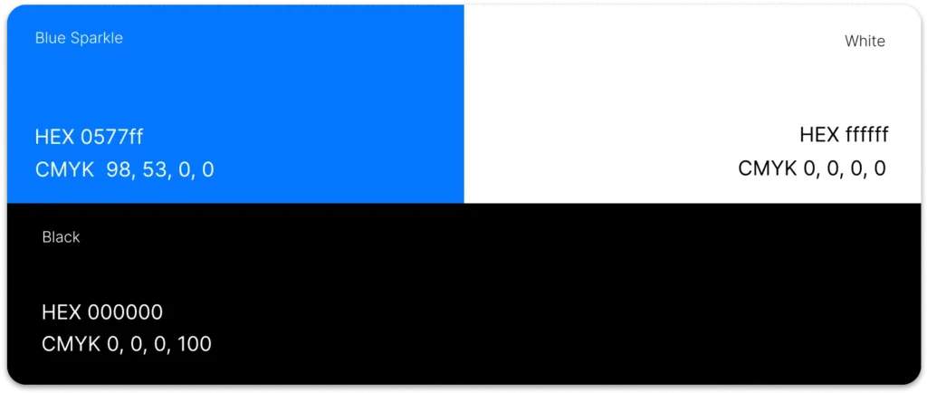
The use of a black and blue color scheme enhances the logo’s modern appeal while conveying trust and reliability—key qualities for a software development company
Typography
We selected the Inter font for its clean lines, readability, and modern aesthetic, aligning perfectly with Zerro’s brand identity.
Outcome
The final branding solution successfully captured Zerro’s identity as a forward-thinking tech company. The design strikes a perfect balance between simplicity and clever symbolism, making the logo not only visually appealing but also meaningful. Zerro’s new visual identity now stands out in a competitive market, giving the company a distinct and professional edge.