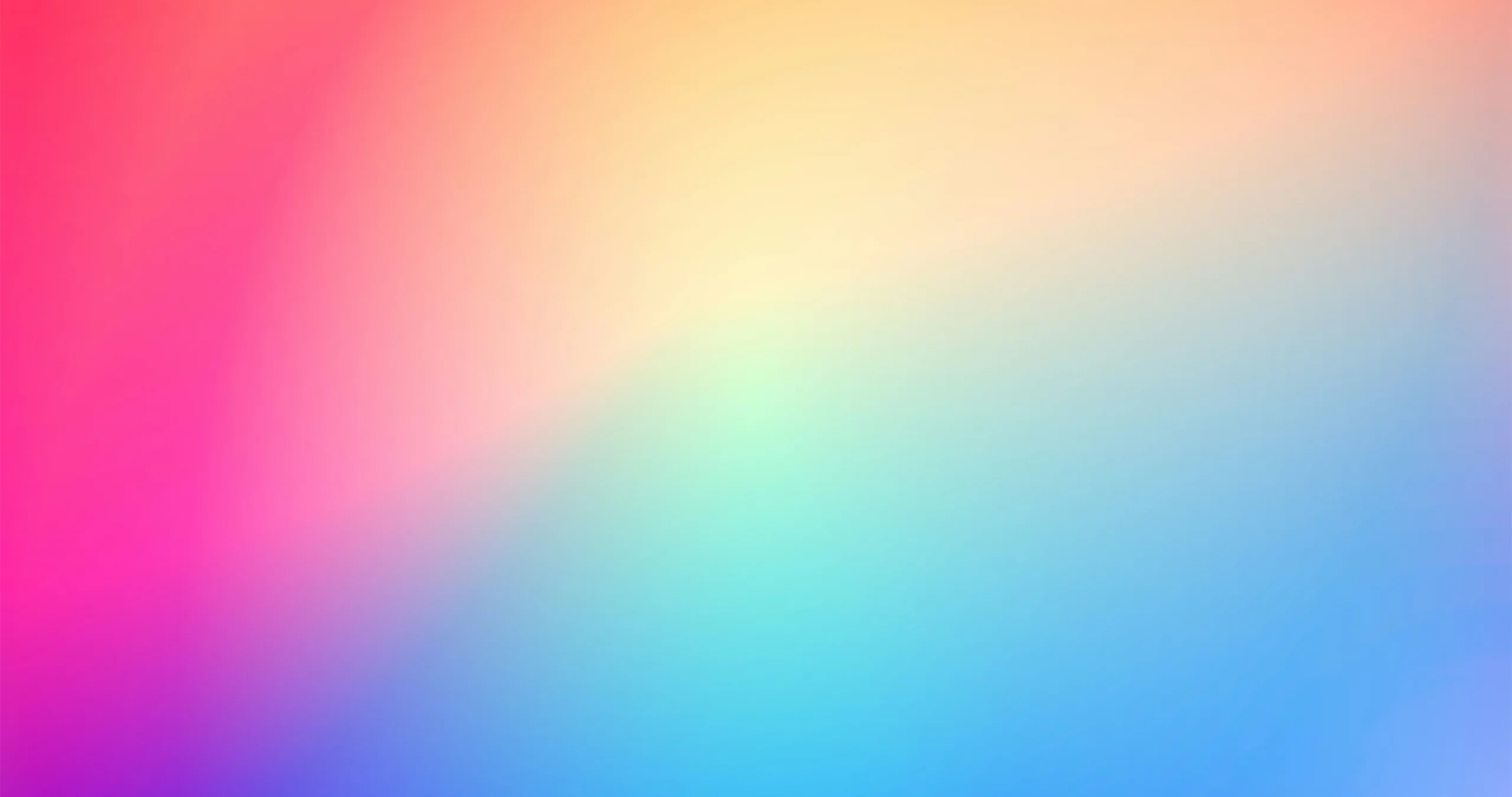
In the ever-evolving world of graphic design, trends come and go. One trend that has been making waves in recent times is abstract gradients. These captivating color transitions and combinations have taken the design world by storm, infusing projects with a sense of depth and creativity. In this blog post, we will dive into the abstract gradients graphic design trend and explore its popularity, characteristics, and how designers are utilizing it in their work. Abstract gradients also known as color transitions, are a gradual blending from one hue to another. Unlike traditional gradients that stick to two shades, abstract gradients embrace a vibrant spectrum. Picture a sunset melting from warm oranges to cool blues, or a neon-lit cityscape transitioning through electric pinks and purples. That’s the magic of abstract gradients!
Captivating Color Transitions
Abstract gradients are all about the smooth transition from one color to another, creating a mesmerizing effect. Unlike traditional gradients that are often linear or radial, abstract gradients take it a step further by incorporating multiple colors and irregular shapes. This unique approach allows designers to experiment with an infinite number of shades, resulting in eye-catching visuals that captivate the viewer.
Depth and Dimension
One of the key advantages of abstract gradients is the illusion of depth and dimension they bring to designs. By defying traditional flat design, abstract gradients introduce an element of three-dimensionality that enhances the overall visual impact. The seamless blending of colors creates a sense of movement and depth, making the design appear more immersive and engaging. Abstract gradients add depth and dimension to your designs. They create an illusion of movement, pulling the viewer into a dynamic visual experience.
Versatility and Adaptability
Abstract gradients are incredibly versatile and can be applied to a wide range of design projects. From websites and mobile apps to social media graphics and print materials, this trend can be adapted to suit various platforms. Designers have embraced abstract gradients to create striking backgrounds, vibrant logos, compelling illustrations, and more. The trend’s flexibility allows designers to experiment and push boundaries, resulting in unique and visually stunning outcomes.
Breaking the Mold
Abstract gradients have gained popularity due to their ability to break free from conventional design rules. Instead of relying solely on established color schemes, abstract gradients encourage designers to think outside the box and create unexpected combinations. This trend empowers designers to experiment with contrasting tones, unconventional color pairings, and even exploring gradients that incorporate textures, patterns, or images. The result is a refreshing departure from the norm, offering a breath of fresh air in the design industry.
Modern Aesthetics
In our pixel-saturated world, abstract gradients inject freshness. They break away from flat design and infuse energy into interfaces, illustrations, and branding.
How to Use Abstract Gradients
Backgrounds: Start by using abstract gradients as backgrounds. Whether it’s a website, social media post, or presentation slide, a well-crafted gradient backdrop instantly elevates your content.
Typography: Apply gradients to text elements. Create eye-catching headings, titles, or call-to-action buttons. Experiment with subtle fades or bold contrasts.
Illustrations and Icons: Infuse life into icons and illustrations. Imagine a mountain range fading from sunrise orange to midnight blue or a futuristic spaceship with a neon gradient hull.
Product Packaging: Abstract gradients breathe life into packaging. Think of a skincare product label transitioning from soft lavender to mint green—a feast for the eyes.
Tips for Creating Abstract Gradients
Irregular Shapes: Break free from linear gradients. Experiment with irregular shapes splatters, blobs, or organic curves. Let the colors flow naturally.
3D Gradients: In 2024, we’re witnessing a surge in 3D gradients. Imagine animated 3D objects morphing through a spectrum of colors. It’s futuristic and captivating1.
Color Harmony: Choose colors thoughtfully. Harmonious combinations create a seamless transition. Tools like Adobe Illustrator and Figma offer gradient generators to play with hues.
Transparency and Opacity: Adjust transparency to create subtle transitions. Overlay gradients on images or textures for a dreamy effect.
Influential Examples for Abstract Gradients
Numerous businesses and organizations have harnessed the power of abstract gradients to elevate their branding and marketing efforts. Tech giants like Spotify and Instagram have embraced this trend in their app designs, utilizing vibrant abstract gradients to create a visually appealing and modern user interface. Other companies, like Airbnb and Dropbox, have incorporated abstract gradients into their brand identity, adding a dynamic and energetic touch to their logos and marketing materials.
Abstract gradients are undoubtedly one of the hottest graphic design trends of our time. With their captivating color transitions, depth, and versatility, they have become a go-to choice for designers looking to create visually striking and engaging designs. Whether it’s in websites, mobile apps, or branding materials, abstract gradients bring a touch of modernity and creativity to any project. So, embrace the kaleidoscope, blend those colors, and let your creativity soar. Whether you’re designing a website, a poster, or a logo, abstract gradients will infuse your work with magic. As the design world continues to evolve, it’s exciting to see how this trend will continue to inspire and shape the future of graphic design.