In today’s fast-paced digital world, where smartphones and tablets have become an extension of our hands, Mobile-first design has emerged as a critical strategy for creating successful websites. Whether you’re a business owner, a web developer, or a curious user, understanding the importance of mobile-responsive design is essential. Let’s delve into why mobile-first design matters and how it impacts our digital experiences.
What Is Mobile - First Design?
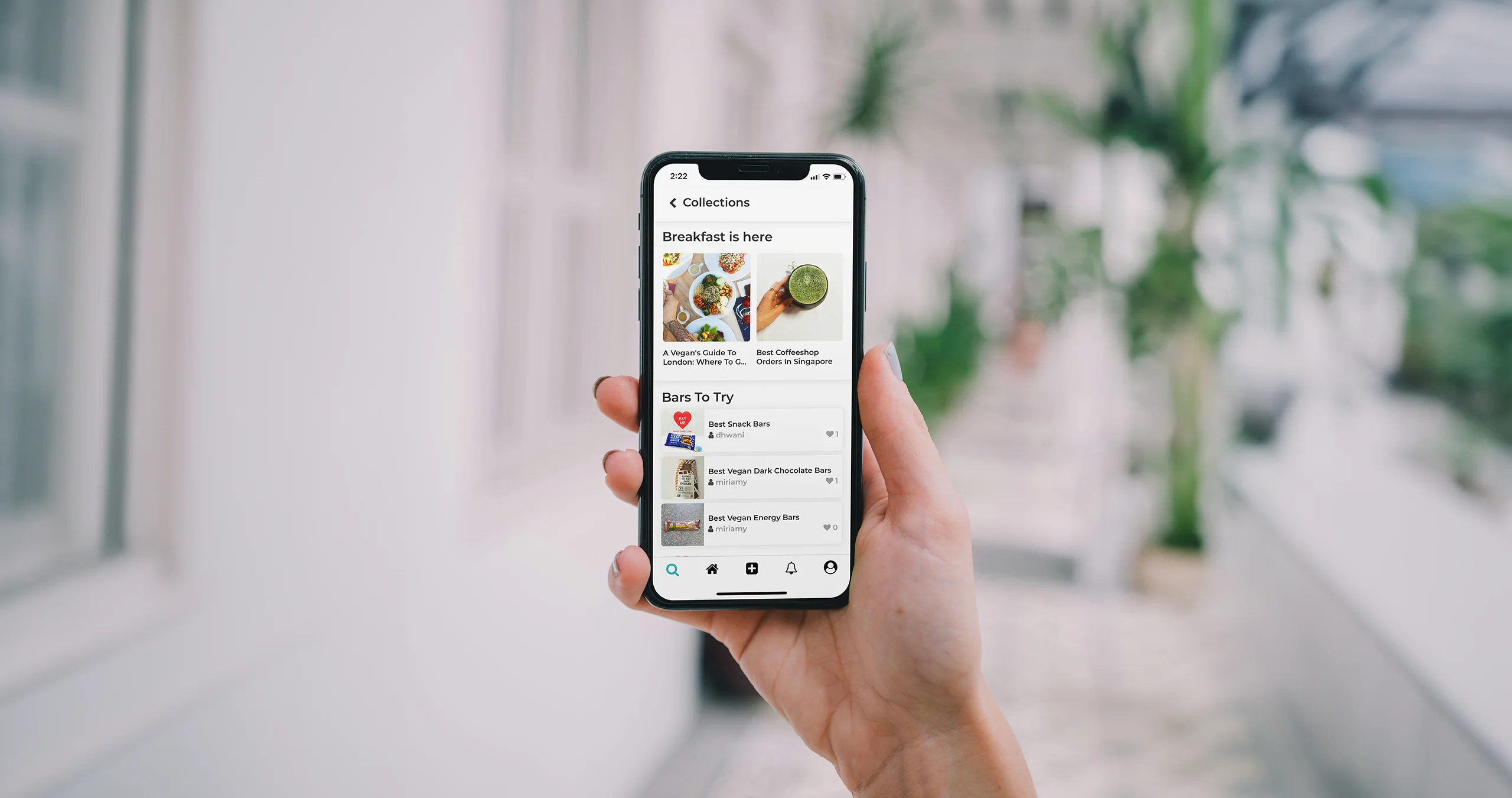
Mobile-first design is a philosophy that prioritizes designing and developing websites with mobile devices in mind from the outset. Rather than starting with the desktop version and then adapting it for smaller screens, mobile-first design flips the process. Here’s why it’s crucial:
Mobile Traffic Dominance: Mobile devices account for a significant portion of web traffic. According to Statista, over 50% of global website traffic comes from mobile devices. Ignoring this audience means missing out on potential customers and engagement.
Improved User Experience (UX): Mobile-first design forces designers to focus on essential elements. By stripping away non-essential features, we create a cleaner, more intuitive interface. Users appreciate websites that load quickly, are easy to navigate, and provide relevant content.
- Faster Load Times: Mobile-first design encourages optimizing images, minimizing code, and reducing unnecessary scripts. These optimizations lead to faster load times, benefiting both mobile and desktop users. Google’s search algorithm also considers page speed, affecting search rankings.
Responsive Across Devices: Starting with mobile ensures that the design adapts seamlessly to various screen sizes. Whether users access your site on a smartphone, tablet, or desktop, they’ll have a consistent experience. Responsive design eliminates the need for separate mobile and desktop versions.
SEO Benefits: Google prioritizes mobile-friendly websites in search results. A mobile-responsive site is more likely to rank higher, attracting organic traffic. Additionally, Google’s mobile-first indexing means it primarily uses the mobile version of your site for indexing and ranking.
Key Strategies for Mobile - First Design
Content Prioritization : Begin by identifying the core content—what users need most. Prioritize essential information, such as contact details, services, and product offerings. Then expand for larger screens.
Responsive Grids: Use flexible grids and fluid layouts. Grid systems like Bootstrap allow seamless scaling across devices. Designers can create a grid for mobile and expand it for larger screens.
Touch-Friendly Elements: Replace hover effects with tap-friendly interactions. Buttons, links, and navigation menus should be large enough for easy tapping. Avoid tiny fonts or buttons close together.
Performance Optimization: Optimize images, compress files, and minimize HTTP requests. Tools like Google PageSpeed Insights help identify areas for improvement.
Test on Real Devices: Emulators are useful, but testing on actual devices is crucial. Check how your site performs on various smartphones and tablets.
Conclusion
Mobile-first design isn’t just a trend; it’s a necessity. As users increasingly rely on mobile devices, businesses must adapt. By embracing mobile-responsive design, we create better experiences, improve SEO, and stay ahead in the ever-evolving digital landscape. So, whether you’re building a personal blog or an e-commerce platform, start with mobile-first principlesit’s the foundation for success.